Overview
VentraGo! is the application marketplace where temporary workers can find gigs from various backgrounds and fields as a workers for clothing stores, movers, cashiers' assistants, order pickers, promoters, and more.
Problem
The application was operational, and there were already initial users actively using it.
However, the number of new users was either stagnant or growing slowly. A significant drop-off occurred during the registration process.
Business Goals
Increase the conversion rate from those who downloaded and launched the application to those who completed all registration stages.
Increase the completion rate of the first task from the marketplace.
Role
I was brought on as an in-house product designer when the project was one and a half years old. My task was to conduct a comprehensive design review of the application, improve UX, gather user feedback and suggestions, prioritize tasks from a business perspective, enhance the visual style, create a UI Kit based on it, and subsequently develop a Design System.
001
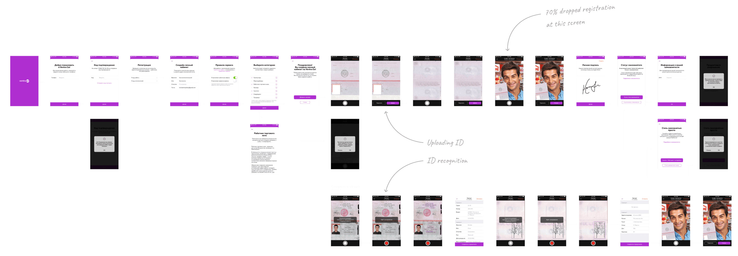
Implemented Design
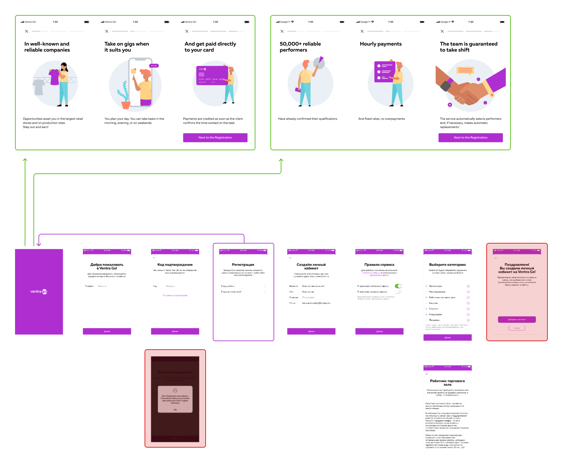
First, I looked at the layouts and conducted a fast design review to understand the primary states. It helps me to develop the next steps.
My findings:
002
UX Audit
During the UX audit, I divided them into three groups.
First, what can be easily and quickly fixed; second, navigation/hierarchy issues; third, visual elements separation.
Later, I planned to use these groups to make decisions about design iterations and implementation of updated flow.
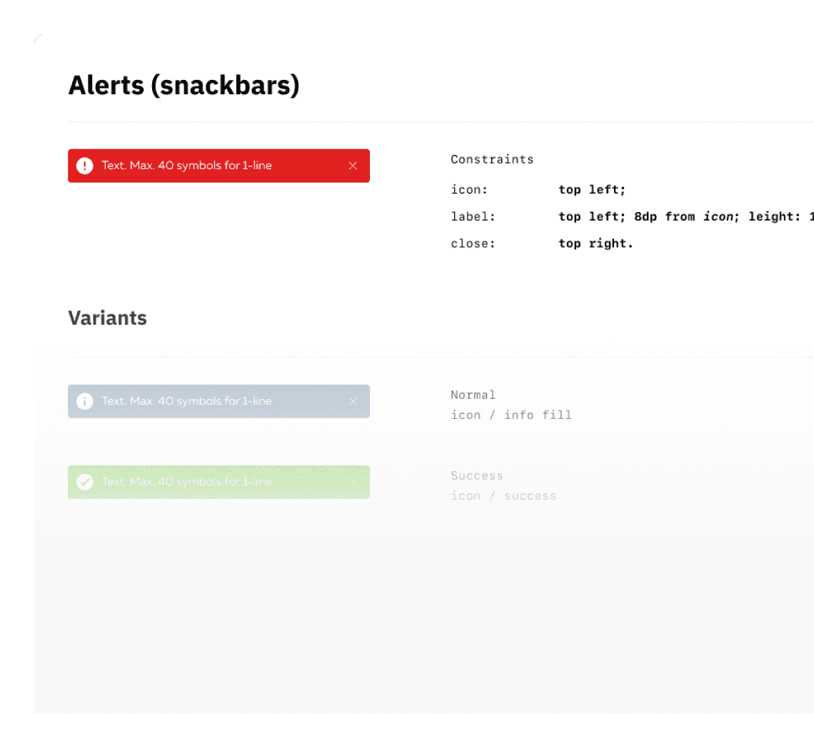
Identified redundant elements (alerts, text, lengthy paths). e.g., up to 5 alerts can be easily replaced by snack bars.
Found simple UX improvements: unify elements, rewrite text, remove some buttons, etc.
Together with business I identified screens and flows that could be relocated outside the registration flow.
It revealed that there needs to be more hints for users about what is happening. I also checked for logical inconsistencies.
003
Users Feedback & Interviews
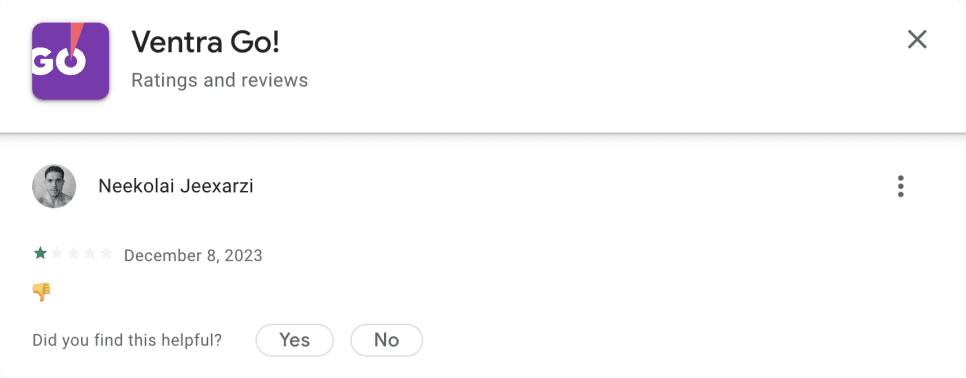
Additionally, to question colleagues who worked on the app for a while, I collected user feedback from the App Store and Google Play and analyzed it.
I combined reviews from markets with feedback received from customer support. After this, it became possible to make certain conclusions, make assumptions, and highlight ideas for next improvements.
In the registration process, we asked users to upload their IDs. This created concerns about users' privacy and the security of their data.
⚠️ Inside: Increase company trust.
The process of uploading a ID is unclear.
💡 Idea: add a step-by-step hint.
“Why do I need to give you so much information without knowing what's inside?”
⚠️ Inside: Increase company trust.
Why do I need to give you so much information without knowing what's inside?
⚠️ Inside: Increase company trust.
Core idea, present at all stages of interviews, testing, and product goals.
💡 Inside: put offers before registration flow
We hoped for new insights in the user interviews but paid much attention to testing existing hypotheses and pain points.
I combined reviews from markets with feedback received from customer support and user interviews. After this, it became possible to make certain conclusions, make assumptions, and highlight ideas for next improvements.
004
Competitors Analysis
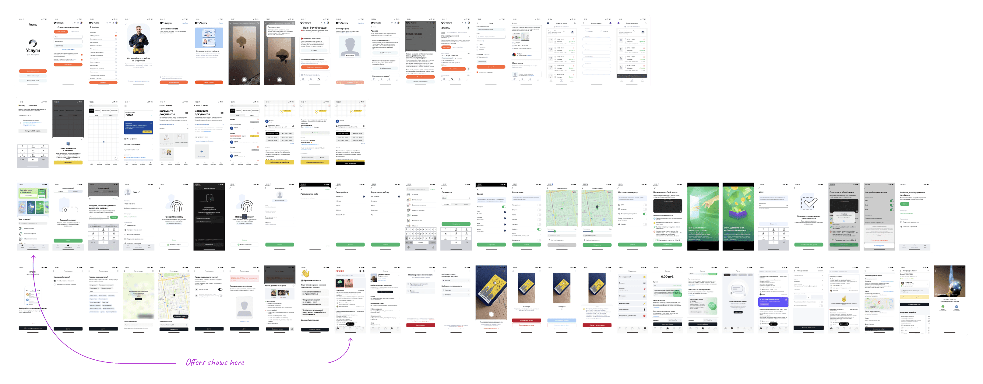
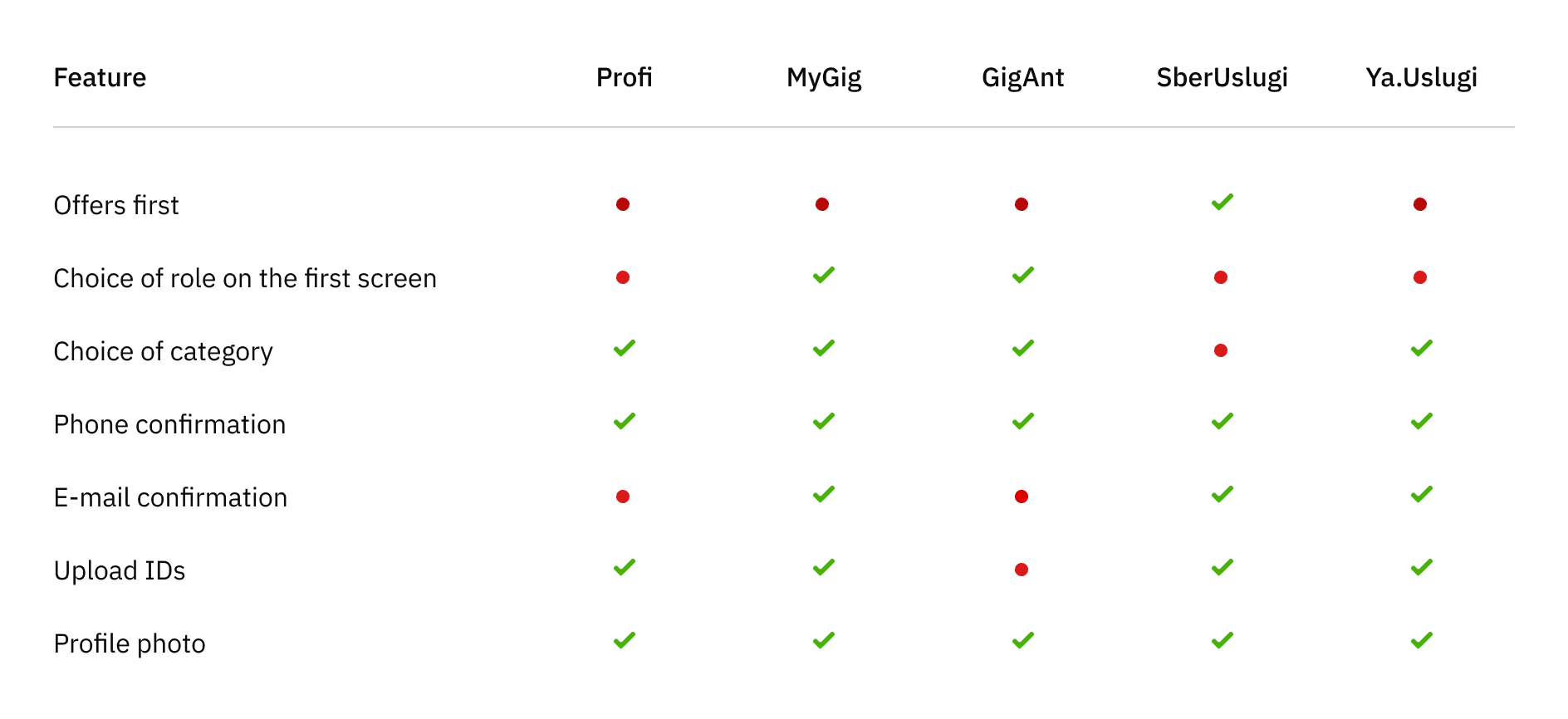
Competitor analysis was conducted to explore how they onboard new users and how much information they asked for before showing the offers.
We also tried to find examples where the offers would be shown first and registration would occur afterward.
Some ideas seemed interesting, and after a discussion with the product owner, I added them to the backlog.
005
Next steps
Having gathered everything together, highlighted the main problems and key insights, and prioritized the importance, we discussed the next steps with the product owner and product manager.
Together with the engineering team, we defined the scope, priorities, possible blockers and low hanging fruits, etc., so that we could start making changes to the layouts and agree on the timeline.
All this was necessary because we already had a large scope of work besides the registration flow, and the development team was busy.
We divided the redesign and integration process into three iterations:
Make an update with maximum benefit but minimal interference in the layouts and flow.
Transfer the ID confirmation process to a new component.
Redesign and remove the registration from the beginning of the flow, making the marketplace available immediately after onboarding.
006.01
First Iteration: Fast Improvements
The first and most straightforward solution for implementation was to make the role selection on the first screen instead
of doing it after phone number confirmation.
The second thing we did was to add onboarding depending on the role chosen by the user.
I removed dialog boxes that covered the entire screen and replaced them with the snackbars and dialog boxes over the screens, improving messaging clarity.
While working on the notifications, I decided that they would become part of the design system in the future and become full-fledged components.
Before:
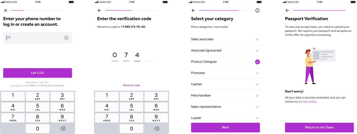
Aside from implementing onboarding, I reorganized the screen sequence. While the categories were initially positioned in the middle of the personal data process, it made more sense to relocate them to the beginning.
After:
Results:
We didn't expect any major changes, but we're pleased to see that the number of support tickets has decreased since we implemented onboarding. Most importantly, it helped us gain momentum and, by connecting analytics, we're now able to get detailed information about user behavior.
006.02
Second Iteration: Updating ID Recognition Component
In this iteration, we swapped out one ID recognition component for another that showed better results. This was an initiative of the dev team, which was supported by the product owner.
My responsibilities included testing the flow of the new component and designing the missing screens for hints, buttons, notifications, and dialog boxes.
Results:
After implementing the new component and providing associated hints, we observed a 20% increase in successful ID uploads and recognitions. This success significantly contributed to a reduction in support requests — a crucial indicator for us.
006.03
Third Iteration: Redesign & Moving the Flow
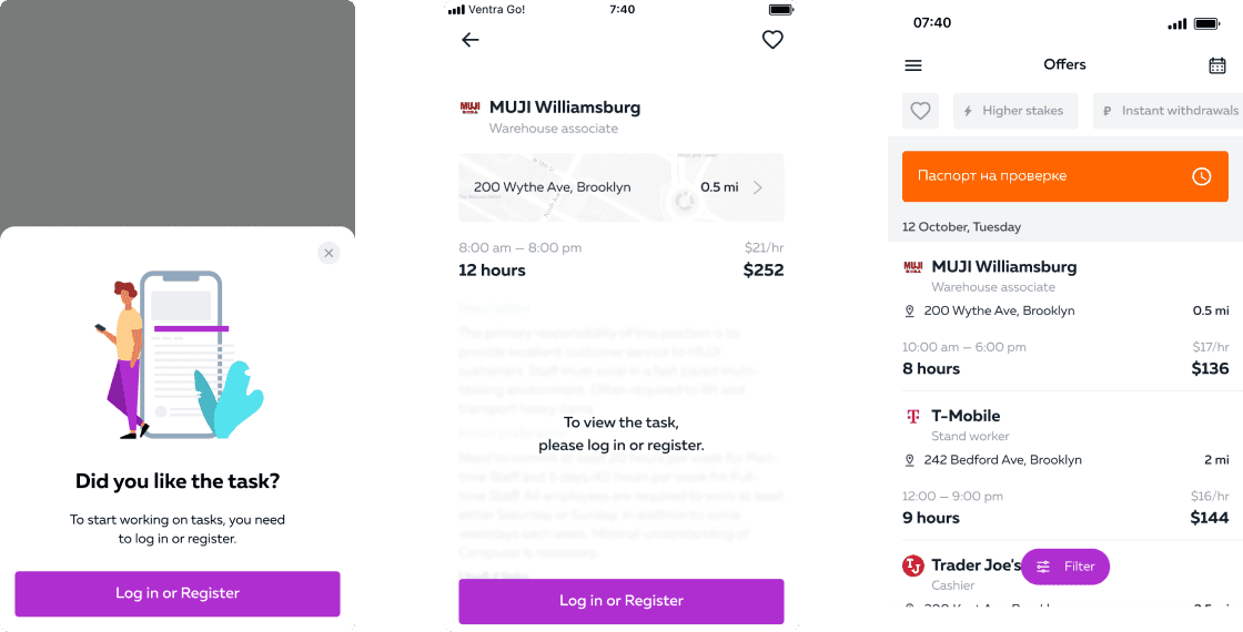
The third iteration was the most critical and time-consuming to implement for us. First, we decided to show the screen with offers immediately and postpone registration and authorization. We also removed onboarding because the user can see everything for himself, and we do not need to convince him.
We also decided to make changes to the design and style of the app (this can be made into a separate case study 🙈).
Offers List
Before → After
Offer
Before → After
The user flow changed again. We added several different points where users could go to registration. I implemented a bottom sheet in the design (and then in the design system as a component), which suggested that users go to registration depending on where they were in the app.
I streamlined the registration by reducing the number of screens and made the rest cleaner and more understandable. I added visual progress and rewrote most of the texts for more clarity.
During implementation, the developers connected this component to the management system, and the product manager or analyst could add it to different points in the app or push notifications, testing hypotheses and conducting tests.
I added status for each state. For example, when the ID is being verified.
007
Conclusion
Working on this project gave me the chance to dive deep into the registration process for VentraGo! and see it through the eyes of real users. By focusing on the areas where users were dropping off, I was able to design a smoother, more straightforward experience that better supports them from start to finish.
This process reminded me just how much even small adjustments can improve the journey and make a real difference. I look forward to seeing how these changes help users feel more connected and engaged, and I’m excited to keep refining the experience as I gather more feedback.
Copyright © 2010 — 2025 Ivan Beloborodov, All rights reserved.
Made with 🖤 in Framer

