Two founders approached me with the idea of creating a dedicated marketplace for expectant and current mothers to help them sell, buy, and exchange items.
As mothers themselves, they experienced firsthand the lack of such a platform. I, as a product designer with prior experience in building marketplaces, saw an opportunity to bring their vision to life.
MY ROLE
User Research
User Interviews
Journey Mapping
Sketching
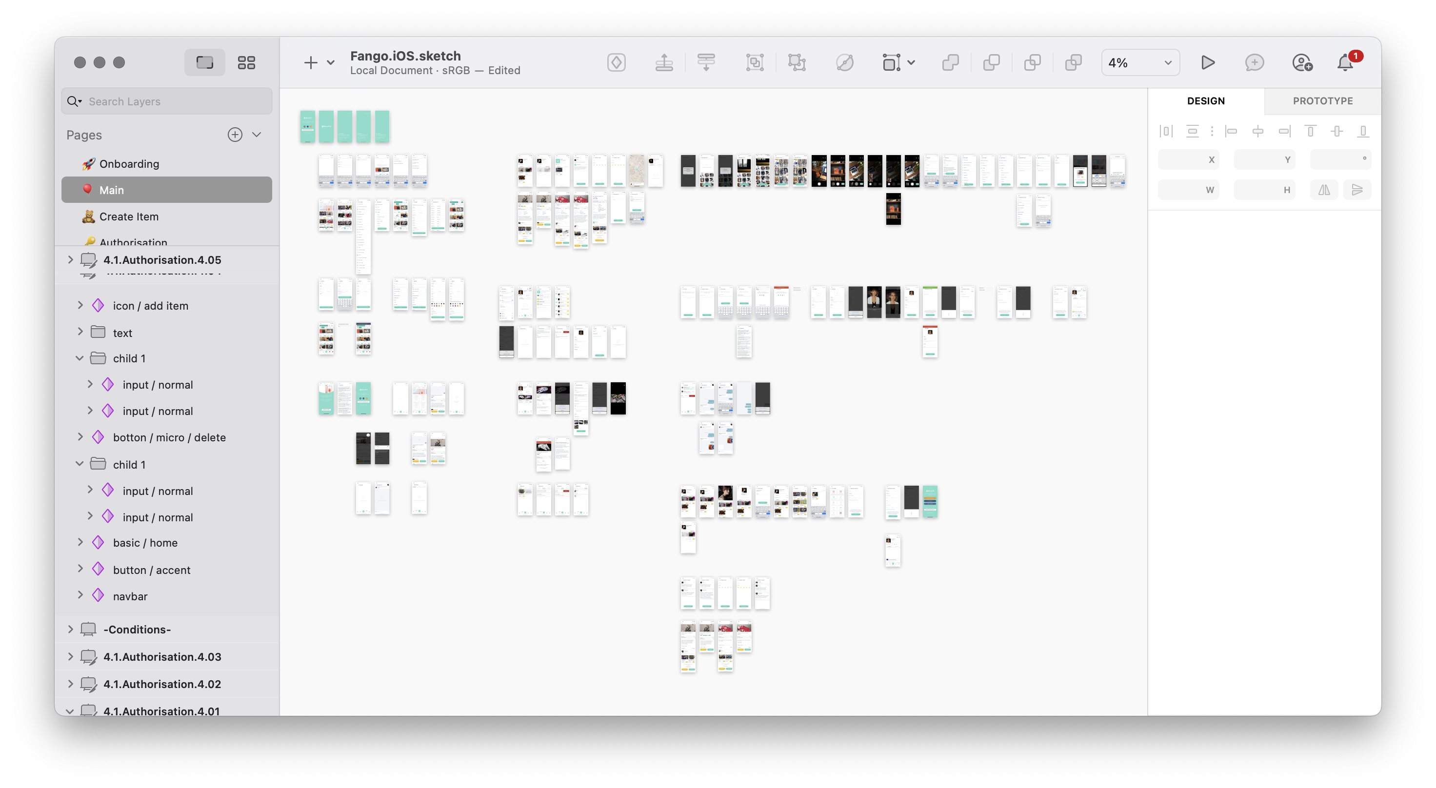
Wireframing
Screen Flows
Visual Design
Interaction Design
PLATFORMS
iOS
Android
YEAR
2019
LINKS (IN RUSSIAN)

CHALLENGE
Stepping into the role of the founding designer in a three-person startup.

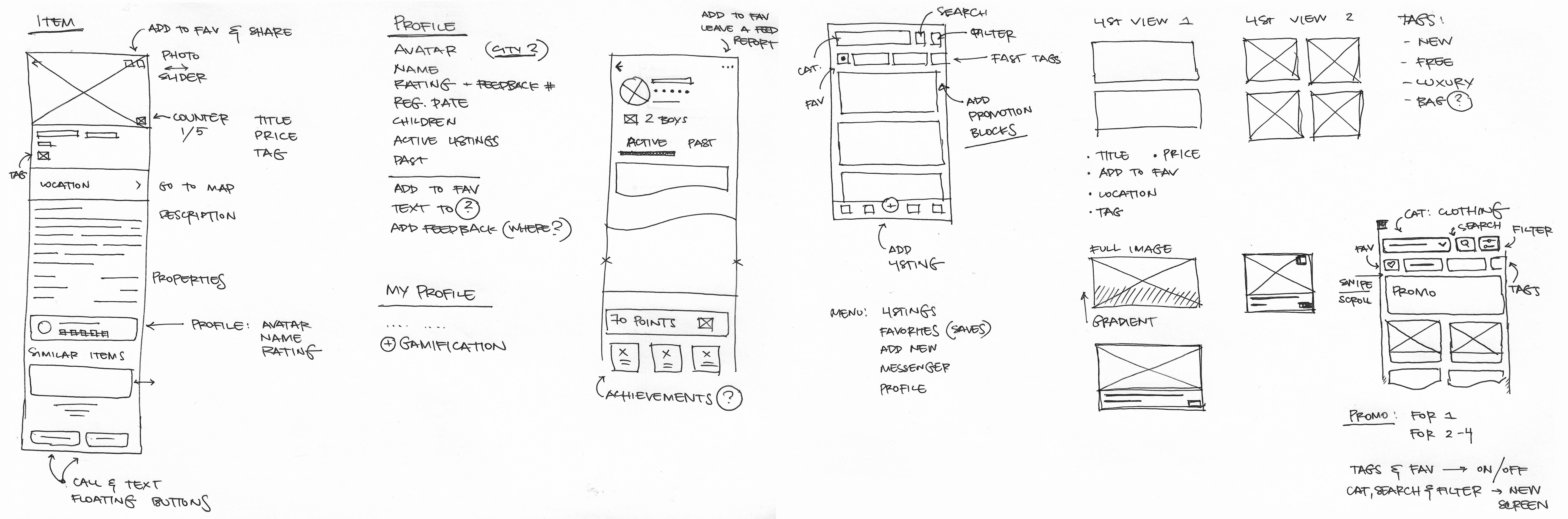
After defining the user flow, I started with rough sketches to explore different layout ideas and navigation patterns. These low-fidelity wireframes helped visualize the key screens and user interactions before moving into more detailed prototyping.
Some of the initial considerations included:
— How to make filtering and searching seamless for busy moms looking for specific items.
— The best way to streamline the listing process for sellers to reduce friction.
— A home feed structure that balances discoverability and personalization.
Once I refined these concepts, I created an interactive prototype to present my ideas to the founders. This early validation phase allowed us to align on the core features and iterate quickly before committing to high-fidelity designs.

Once the initial prototype was ready, I tested it with the founders and a small group of target users—expectant and current mothers. The goal was to gather early feedback on navigation, usability, and core functionality.
Key insights from this phase included:
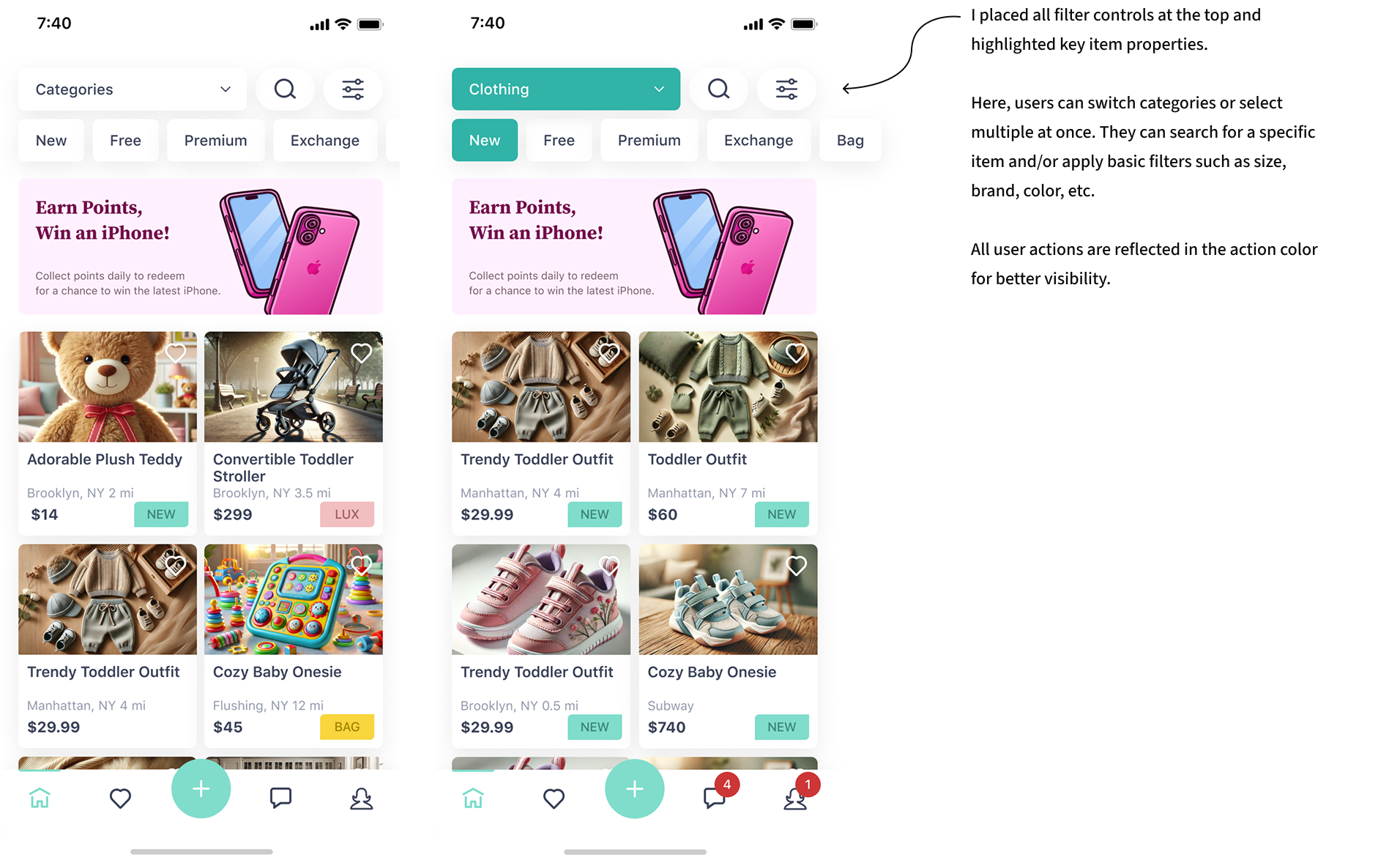
— Users appreciated the simplicity of filtering and categorization but requested a more prominent search function.
— The selling process needed clearer guidance, as some users were unsure how to list items efficiently.
— Visual hierarchy improvements were suggested for better readability, especially for product descriptions and pricing.
Based on this feedback, I refined the onboarding experience, adjusted UI elements for clarity, and optimized the selling flow to make it more intuitive.


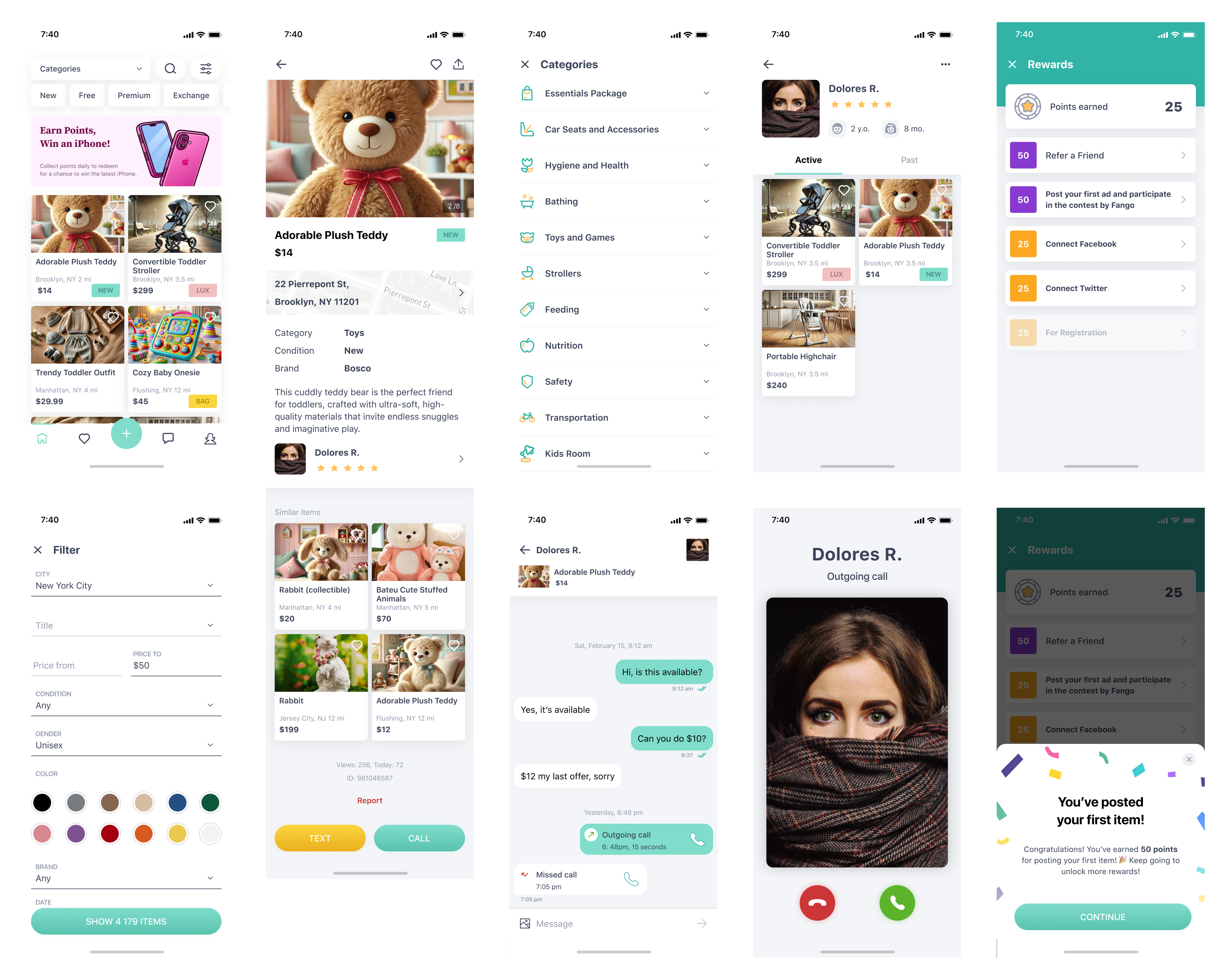
I created a style guide to ensure a consistent and user-friendly experience while keeping development simple. The design used system fonts and native font styles for iOS and Android, making the app easier to build and maintain.
A soft pastel color palette created a warm, inviting feel, with a distinct action color highlighting key interactions. I also designed custom icons for each category, making navigation clearer and visually distinctive.


I focused on making the marketplace easy to use and more helpful for buyers and sellers. User profiles showed ratings and past transactions to build trust. A chat feature let users talk directly, making deals faster and smoother. To help people find items nearby, the app used location-based listings, reducing the need for shipping.
To keep users engaged, I added a simple reward system where they earned points for listing items, making purchases, and inviting friends. These small details made the app more useful, safe, and enjoyable for everyone.

The project was successfully tested, launched, and showed strong results not only at launch but also in user retention.
After the launch, I continued making small improvements alongside a newly hired product manager to refine the experience.
This project reinforced the importance of close collaboration between the business, designer, and end users. Understanding their needs and working together was key to creating a successful product.