Overview
This is a travel app, that enables users to book flights, trains, hotels, and tours, offering a comprehensive set of tools for managing travel plans. Established in 2011, it supports millions of users with reliable access to over 800 airlines, 2 million accommodations, and global transport options.
In addition to its core services, the app integrates with FinTech solutions to offer customizable travel portals for loyalty programs and was recognized as one of the Top-5 Travel Apps on the App Store and Google Play in 2018.
Story
I was the lead and sole product designer responsible for the company’s mobile applications. One day, an analyst approached me and said:
— Ivan, how about we explore ways to increase the company’s revenue by making some changes to our mobile app?
— Sure! I’m in!
Although I had a lot on my plate, I made time to collaborate with the analyst. Together, we started brainstorming areas in the app where we could either improve the user experience or implement changes to boost revenue.
After reviewing several cases and analyzing the app’s main flows, we identified an opportunity within the flight booking process. Specifically, we saw potential to enhance the way we offered additional services to users during ticket purchases.
Recognizing this as an area with room for improvement, we decided to focus our efforts here.
What are Value-Added Services?
Value-Added Services (VAS) are extra features that enhance the travel experience by offering convenience and flexibility. These include options like online check-in, real-time flight notifications, ticket refund flexibility, and travel insurance, allowing users to tailor their trips to their preferences while saving time and effort.
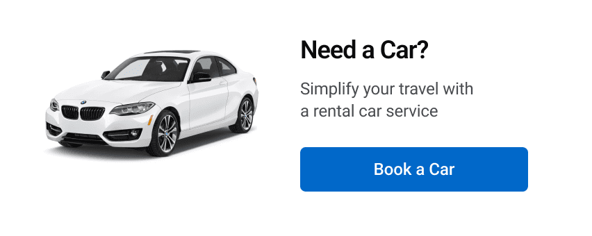
Added services for and e-commerce
VAS for secure financial transactions
VAS after booking a hotel
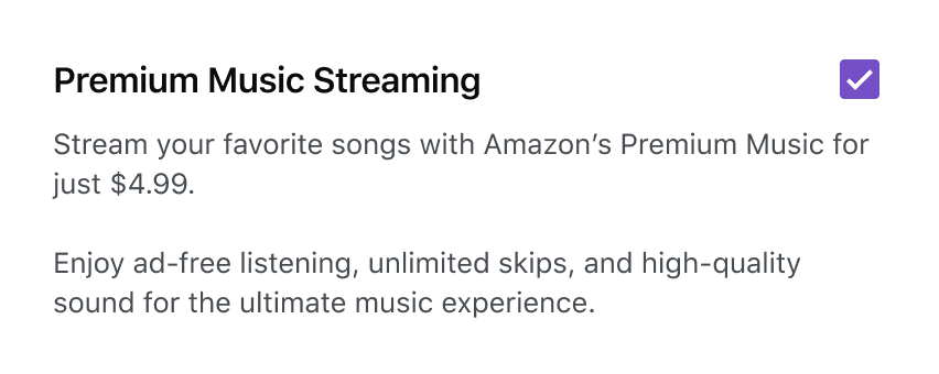
Enhancing entertainment options
Planning the Approach
I started by making a simple plan. First, I wanted to go through the flight checkout flow myself to spot any areas that could be improved. Then, I looked for references and inspiration from other apps to see how they handled similar situations.
I also had a quick chat with our Product Owner to get their input and ideas. With that, the next step was clear—sit down with the analyst again, share what I’d found, and figure out the best way to move forward together.
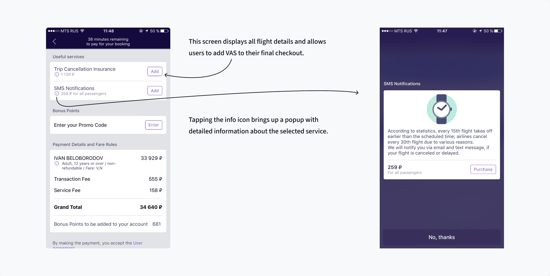
Original Designs
The app had not been redesigned for the past four years
Getting Things Rolling
I went back to the analyst with my ideas and initial sketches, and we discussed them in detail. Once we were aligned, we approached the Product Owner to get the green light to move forward with the task.
To make room for this project in my schedule, I asked the Head of Design to adjust my work schedule. We also reached out to the mobile development lead to secure a developer for the task. We were assigned an Android developer to help us get started.
With everything in place, we were ready to kick off the redesign and begin making improvements.
Action
The analyst and I essentially became the product owners of this feature, which allowed us to make decisions independently.
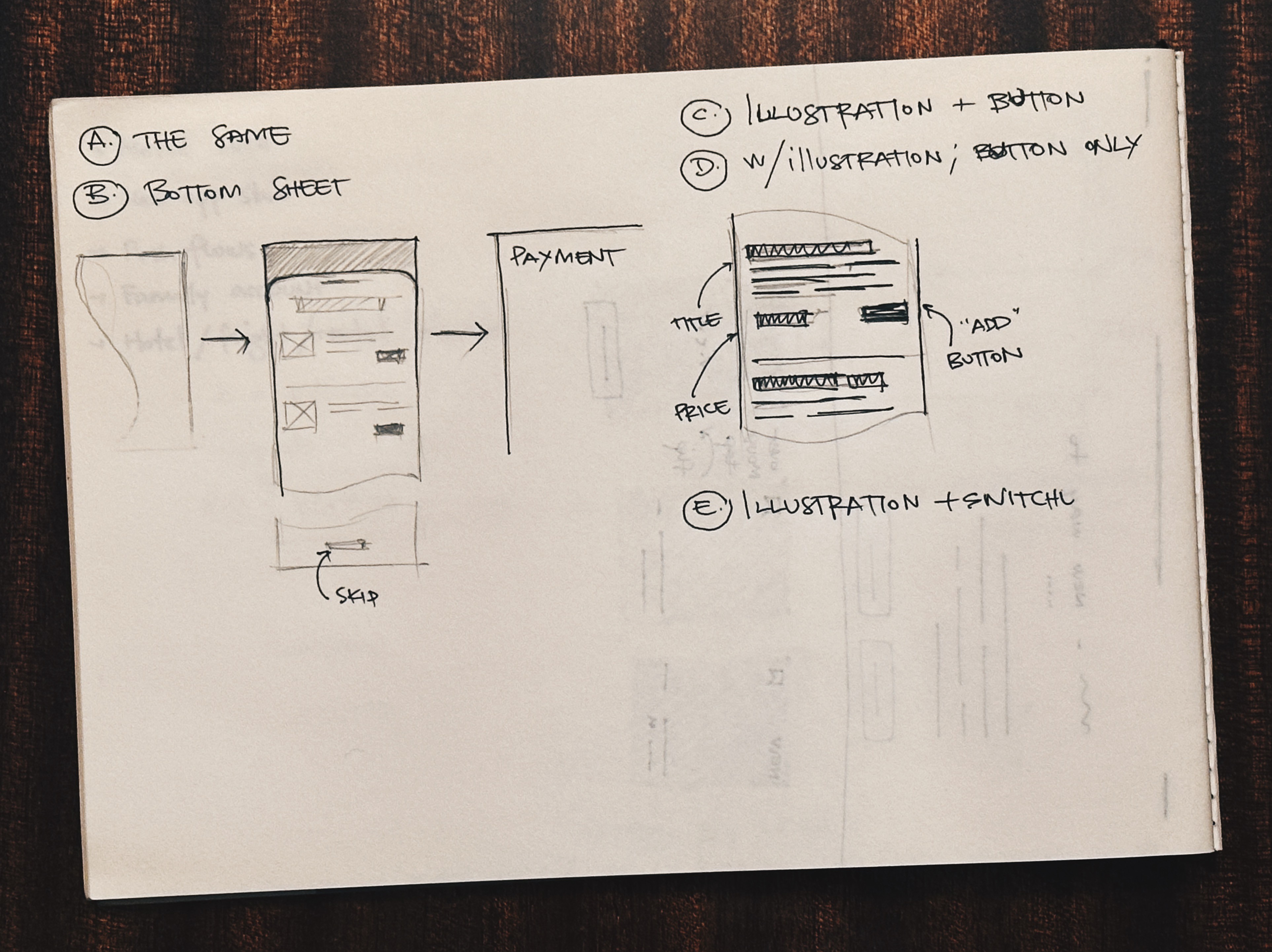
We decided to create four additional variations, and two of them were sent to the A/B/C test to evaluate different approaches. These variations set the stage for a comprehensive testing phase to find the most effective solution.
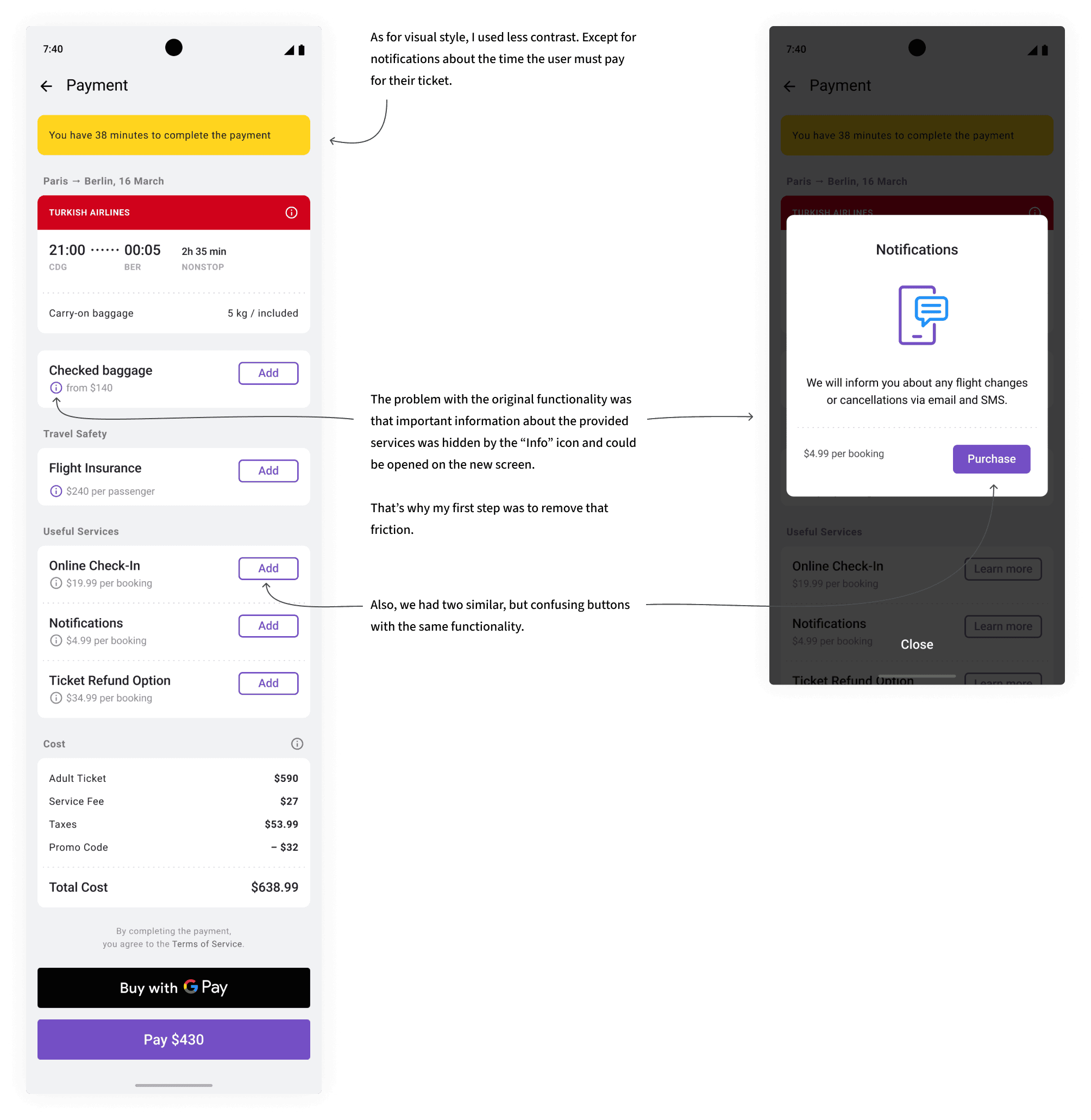
A. Original with Popup. Point to get base from
I made some improvements in visual style, but the whole idea of opening popup by tapping on “Info” icon I left the same.
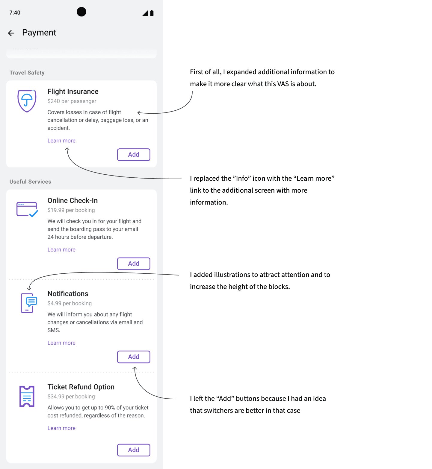
B. Illustrated Options with “Add” Button
Each VAS featured an illustration and a clear “Add” button for selection.
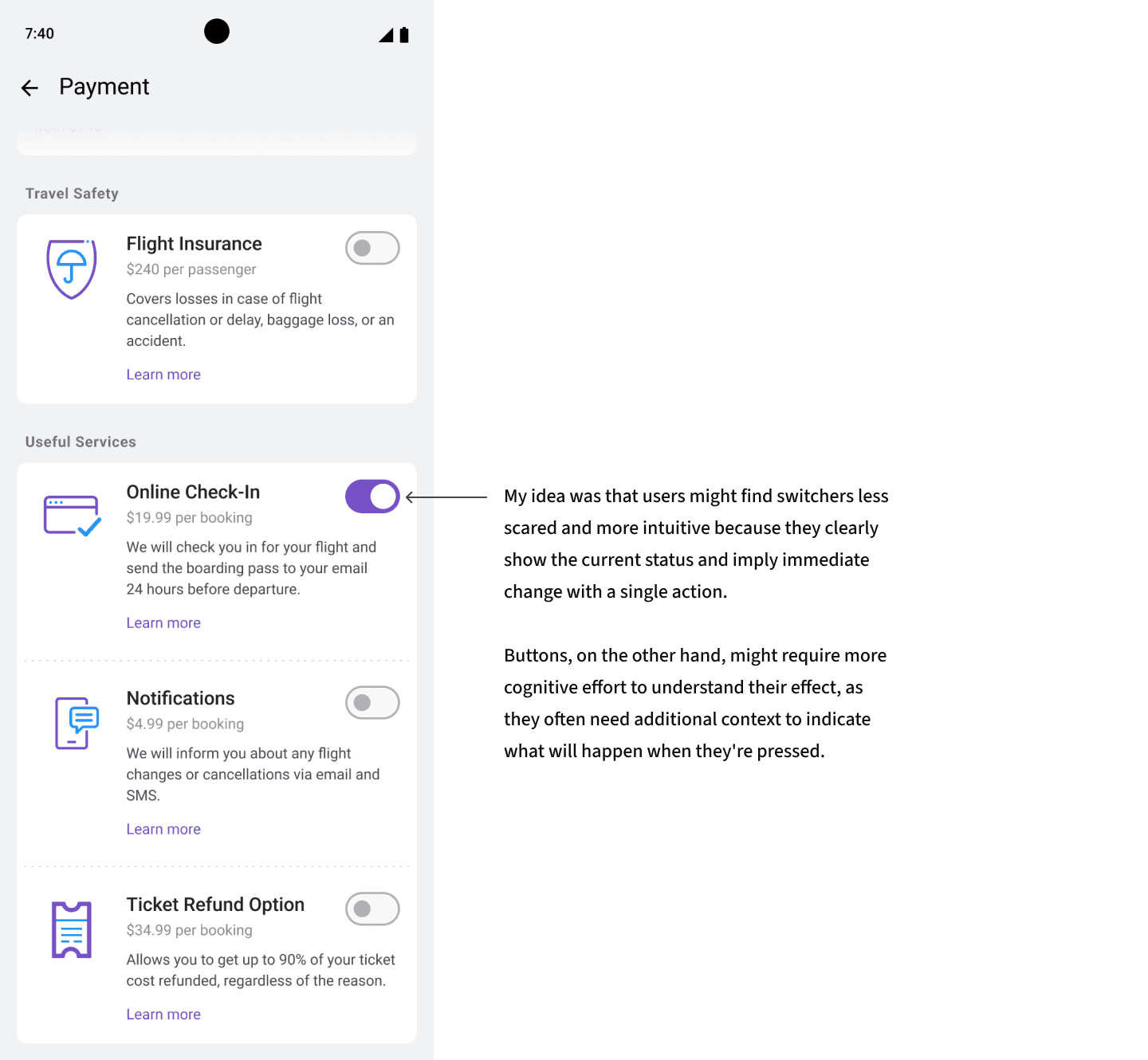
C. Illustrated Options with Switcher
Similar to B, but with a toggle switch instead of a button for adding services.
These were our final, approved mockups that served as the foundation for implementation.
Results
After one month of development and testing, we launched our experiment. Two months later, we received measurable results:
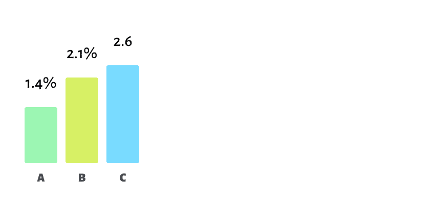
A. Original with Popup: 1.6% of users added one or more VAS during checkout. This served as a useful baseline.
B. Illustrated with "Add" Button: This variant, with illustrations and extended information, drew more attention, increasing VAS adoption. We were pleased with the improvement.
Percentage of people who bought one or more VAS at checkout
C. Illustrated with Switcher: My favorite "switch" variant showed a 0.4% increase compared to the button version. This result confirmed my hypothesis that buttons can feel intimidating, while toggles are perceived more positively by users.
The difference between the B and C variants is just 0.4%, yet it translates to 10 times the Product Designer’s salary.
Conclusion
This might have been a small part of the workflow, but it stood out because it wasn’t part of the usual processes or tasks. It was just two colleagues deciding to take the initiative and make something better, and in the end, we pulled it off with great results and a solid boost in profit.
What I loved most was seeing how a product designer’s ideas can directly impact the product, the business, and the revenue.
This story is also one of my favorites because it shows how anyone on the team can take ownership of a feature and see it through to the finish line. It’s proof that when you care about the product and the team, amazing things can happen.


